Seed
Part of the Common Interest group, Seed is a youth-focused marketing agency that connects brands with students through bold campaigns that resonate and inspire sharing.
Despite undergoing a brand refresh in 2022, Seed's visual identity gradually lost energy and impact amongst a growing number of youth-oriented agencies. The goal was to update the brand, redefining its look and feel to better reflect Seed's positioning, personality, and the vibrant audience it serves.
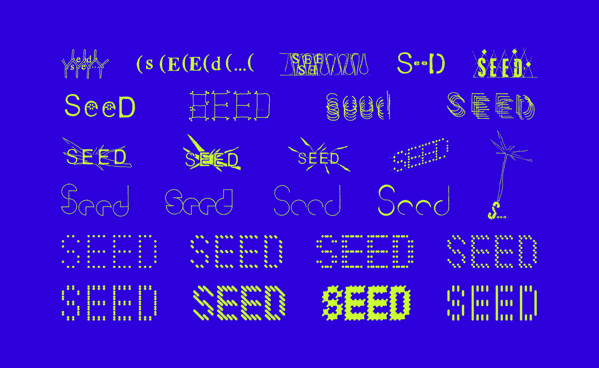
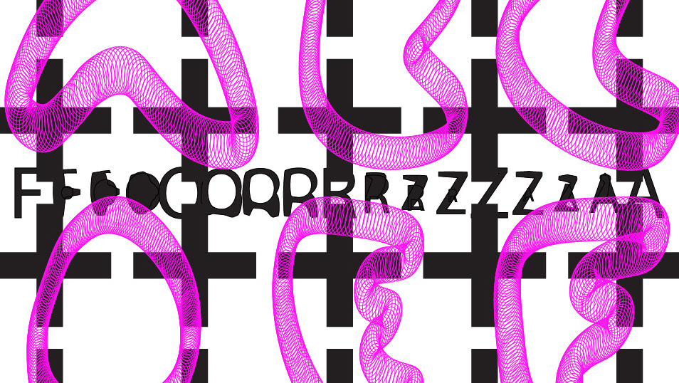
As Seed's primary objective is to bring students and brands together, early logo concepts explored the theme of connection. More literal interpretations of the brand name were also proposed. These played on the evocative nature of the word 'seed', calling to mind images of growth and vitality. A custom dot matrix style font became a metaphor for individuals combining to form something greater than the sum of it's parts, in addition to being a direct reference to the brand name. This concept was then developed further to reinforce the idea of connection.
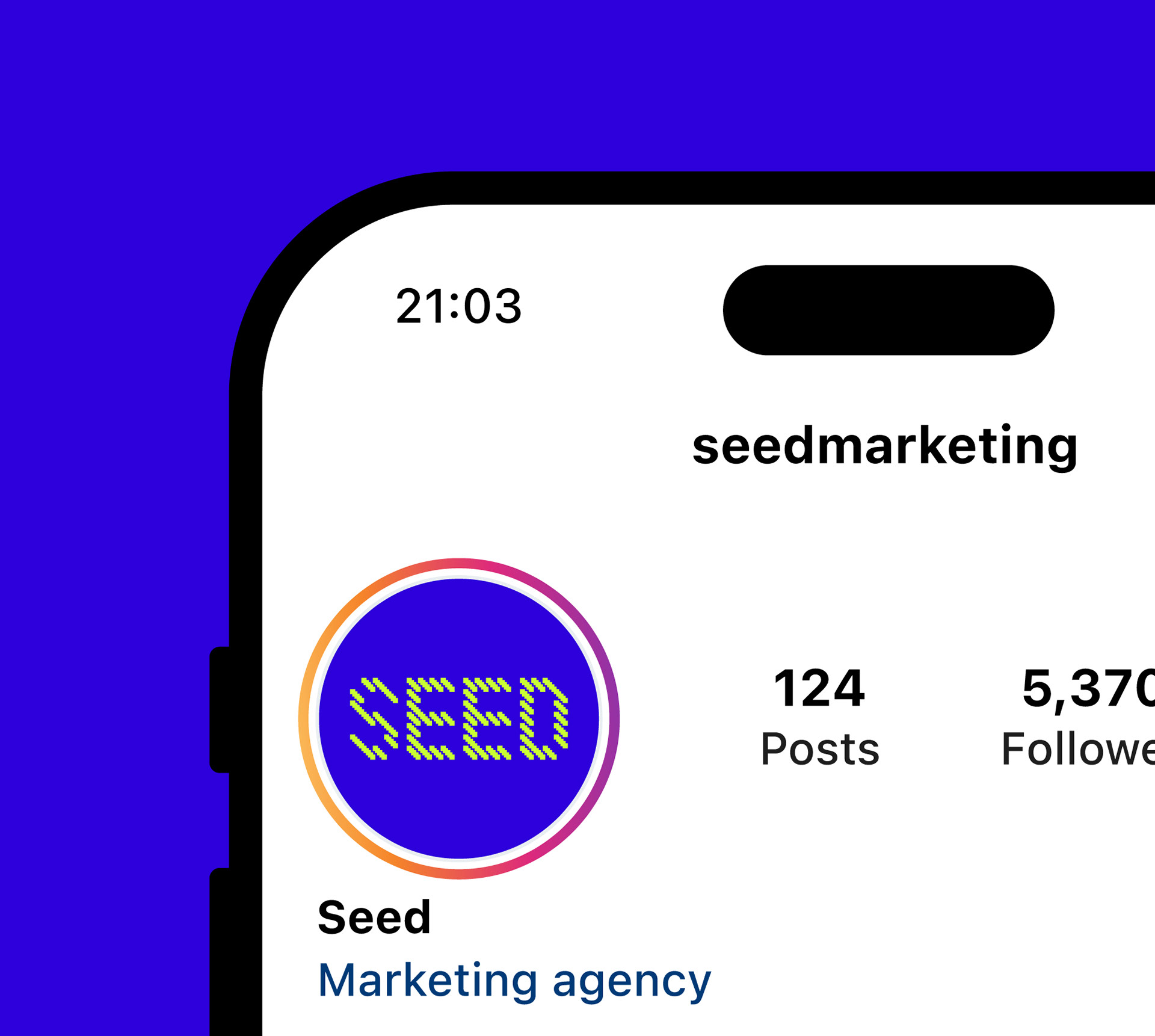
The final wordmark is constructed from square pixels rather than dots, giving the brand a literal and figurative edge. It retains some of the playfulness of the original wordmark, while more coherently communicating the core brand values.
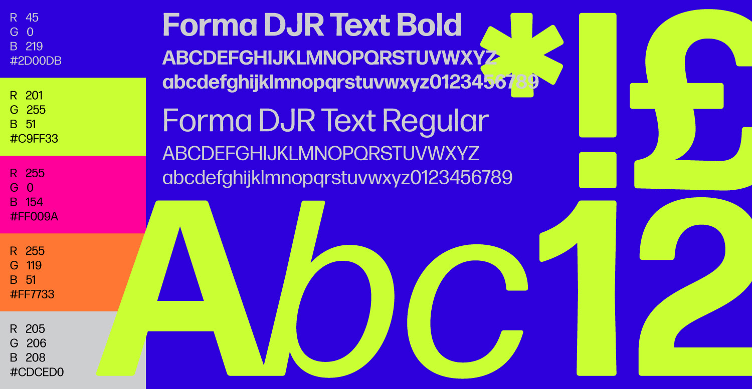
An unapologetically bold colour palette separates Seed from its competitors and helps make the brand instantly recognisable. The identity relies on an easily applied typographic system using a single typeface in two weights. Forma DJR is a revival of a mid-century neo-grotesque from the Italian Nebiolo foundry. Subtle tweaks, such as rounded corners and tapered stems, provide character while maintaining legibility at multiple scales.
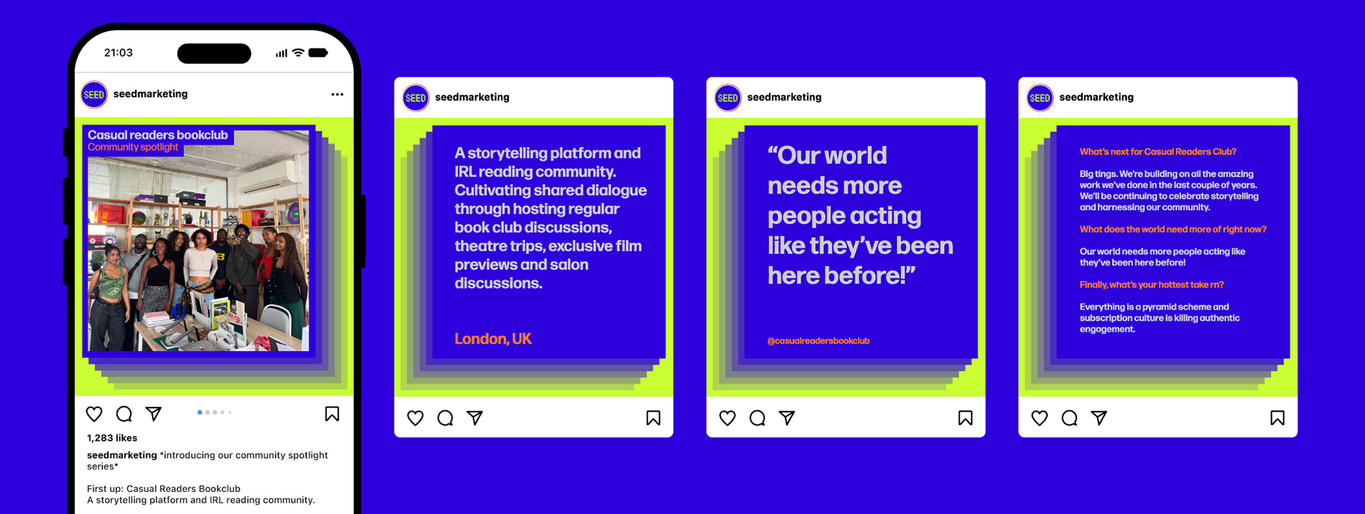
Social media posts incorporate playful animations that reflect the spirit of the brand and speak directly to a youth audience. Carousel post templates are simplified and designed to be adaptable across departments, accommodating varying levels of design experience within the agency.
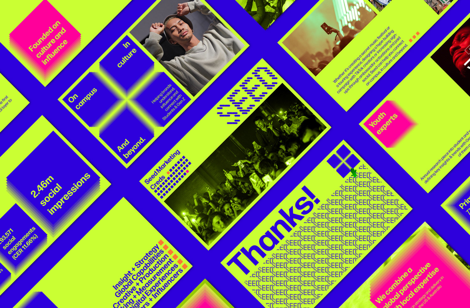
A presentation for Seed's marketing credentials designed around the repeating square motif which features extensively throughout the brand identity.
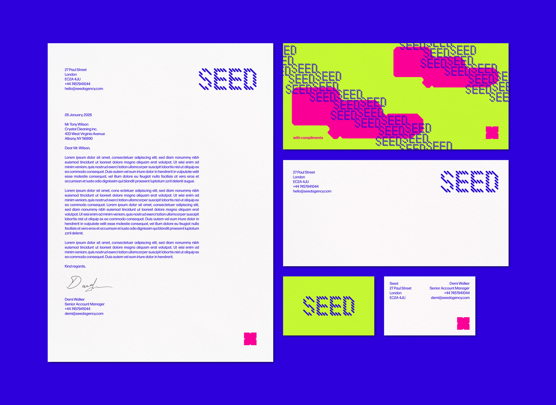
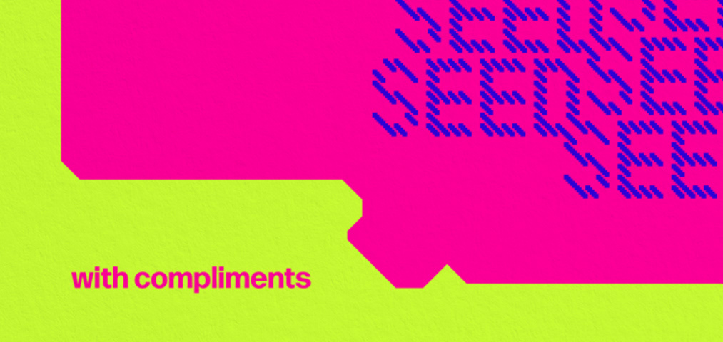
The letterhead, compliment slip and business card employ a more restrained design language to reflect the formal nature of the correspondence they accompany.
Landing page for the Seed website incorporating subtle scroll and hover animations. In contrast to the student-focused social media posts, the target audience of the website is prospective brand partners. This guided the decision to highlight previous projects, allowing the agency's dynamic work to speak for itself.
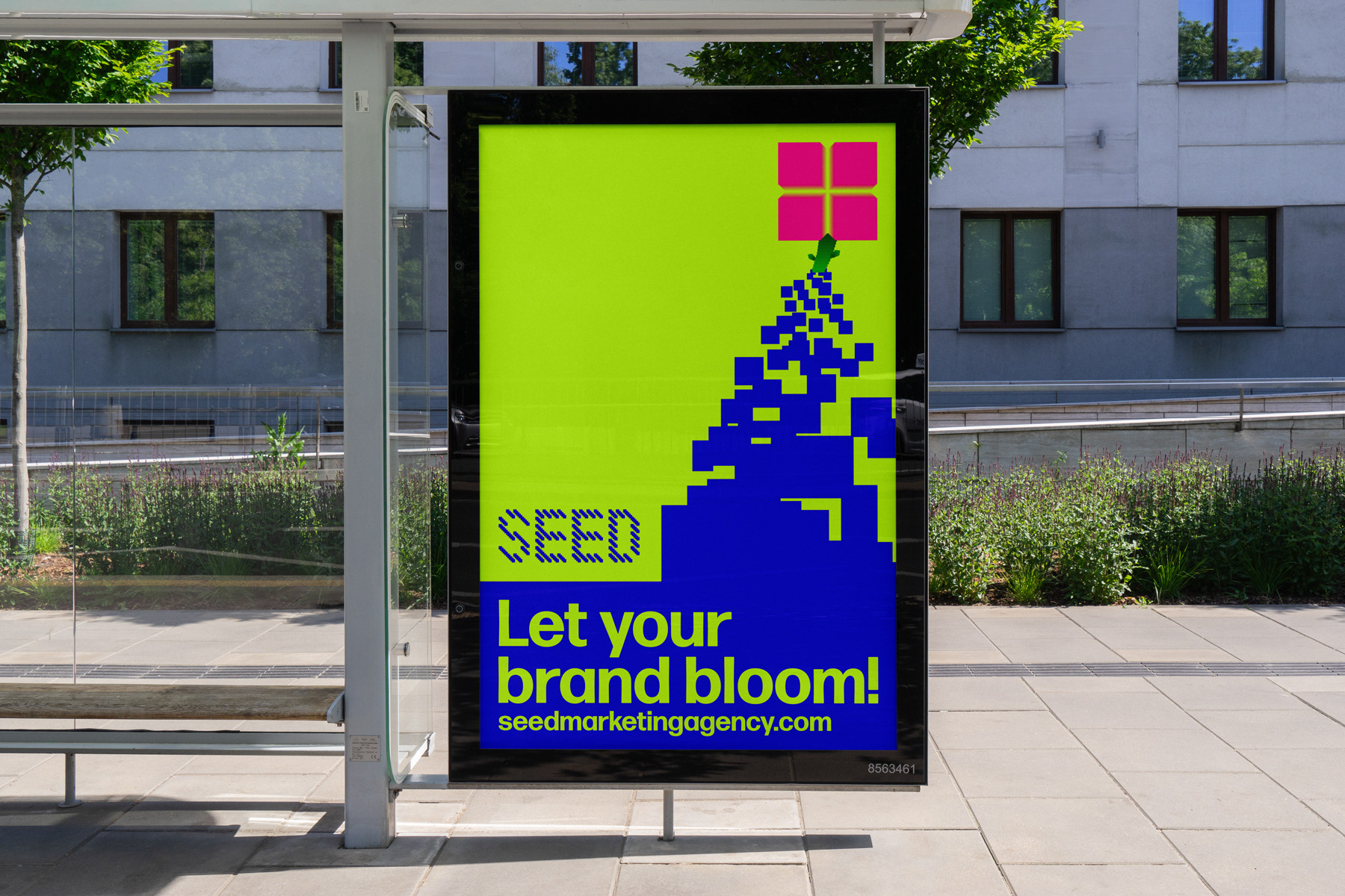
Out-of-home advertising expanding on the logo and flower motif.