Overview
We-Collective.com is a new digital platform and community space celebrating creativity in all its forms. At the heart of the brand is a collective blog that shares diverse, inspiring content.
Objective
To design a blog that serves as a showcase for innovative works of art, music, fashion and film. This was to be supported by a strong visual identity, designed for consistent deployment across multiple touchpoints, to generate excitement for the upcoming blog launch.
A primarily neutral palette of colours and textures was chosen to avoid detracting from or clashing with the work featured on the blog. The bright orange wordmark serves as the cornerstone of the visual identity, capturing the assertive and contemporary character of the brand.
At the core of the brand sits the blog, designed to showcase a broad range of content within a responsive 12-column grid system that adapts fluidly across formats. Interactive details, such as hover animations in the signature orange brand colour, reinforce the connection to the wordmark. Additional animated features, including the 'subscribe' section, highlight key calls to action and encourage ongoing engagement.
The We-Collective Café played a pivotal role in raising awareness of the brand, bridging the gap between the blog’s digital space and the physical community of its users. The repeated circular motif used across the marketing materials was inspired by sonar systems found on submarines, symbolising the search for fresh and exciting creative voices, a central requirement of the brief.
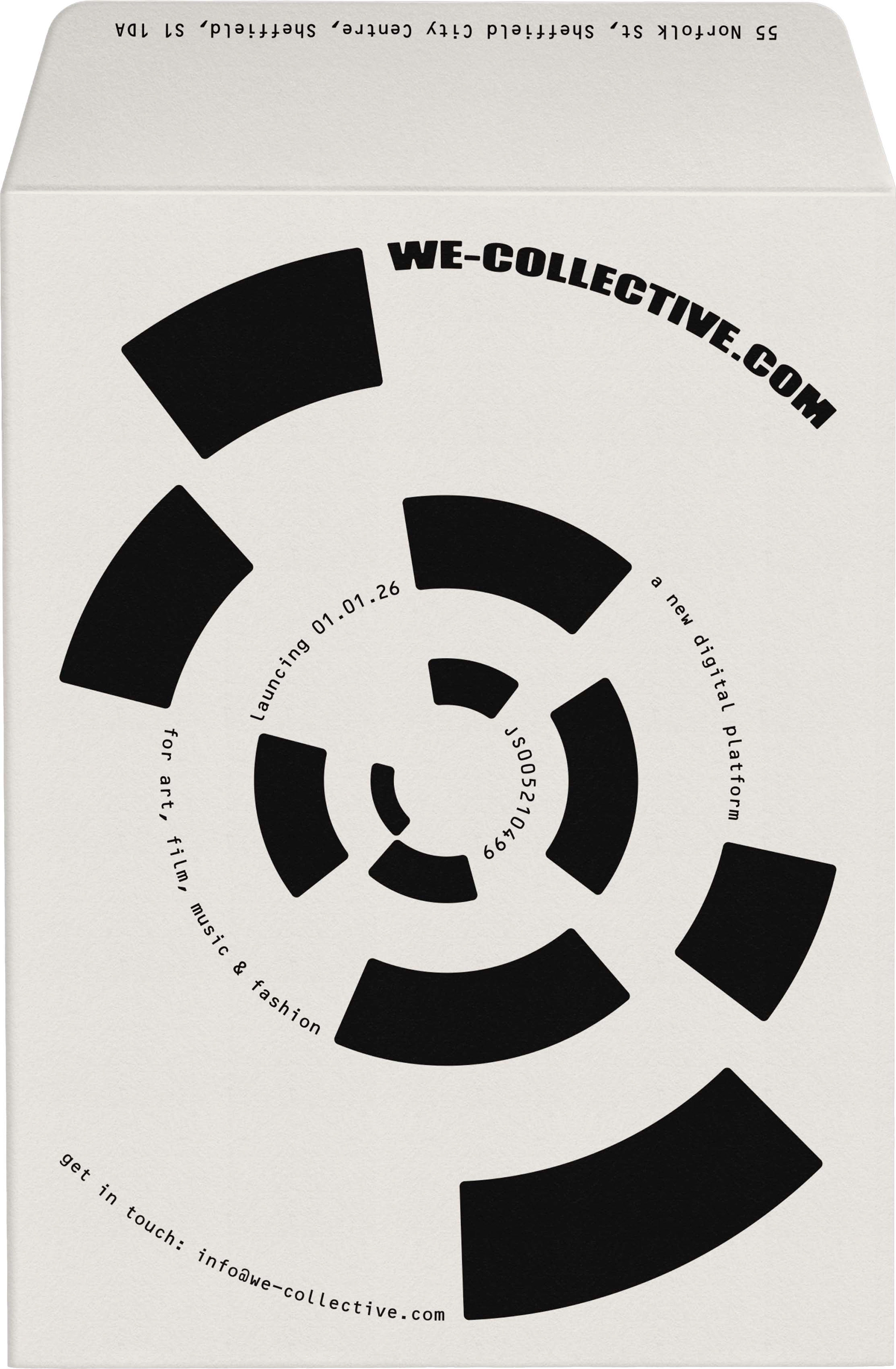
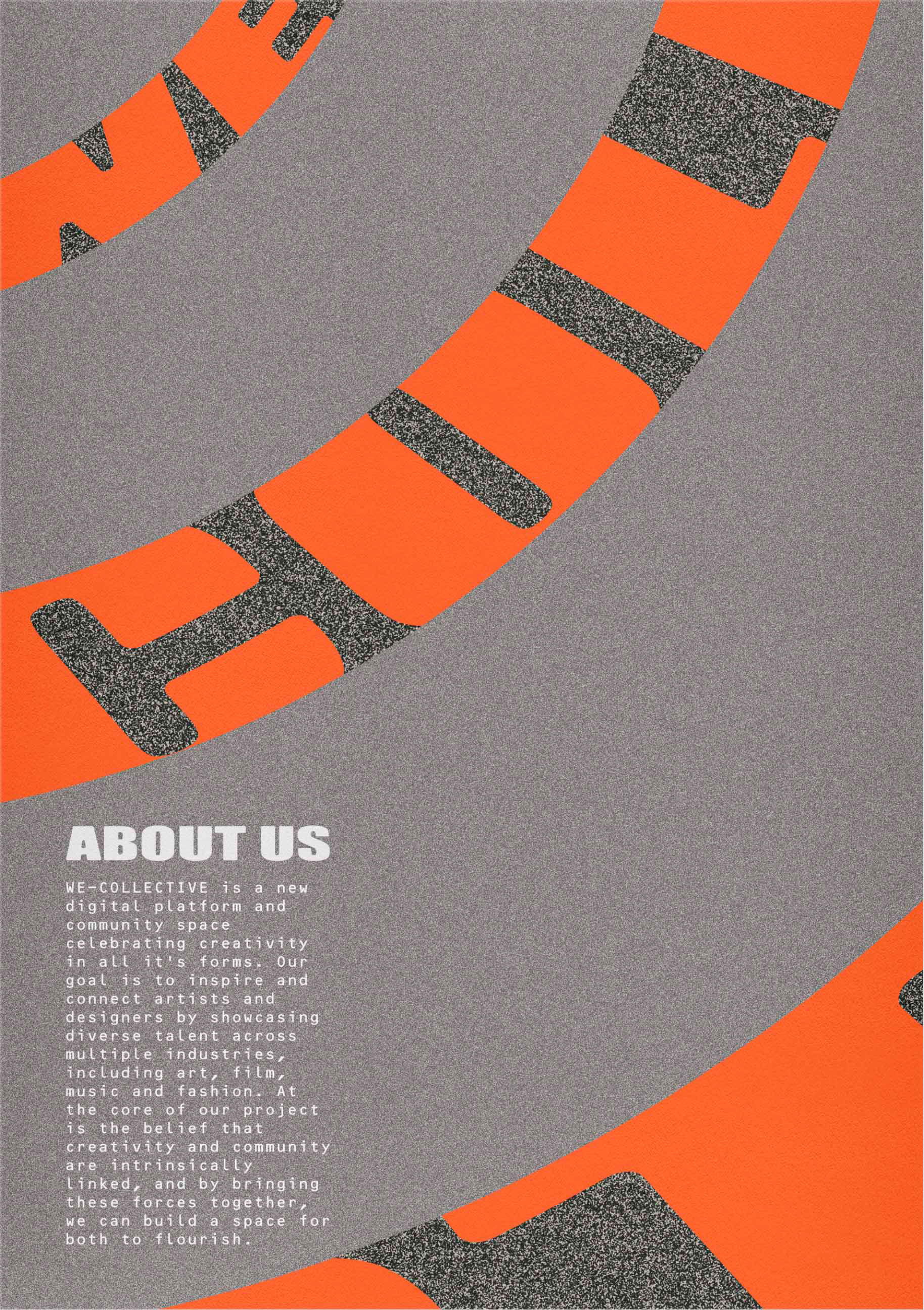
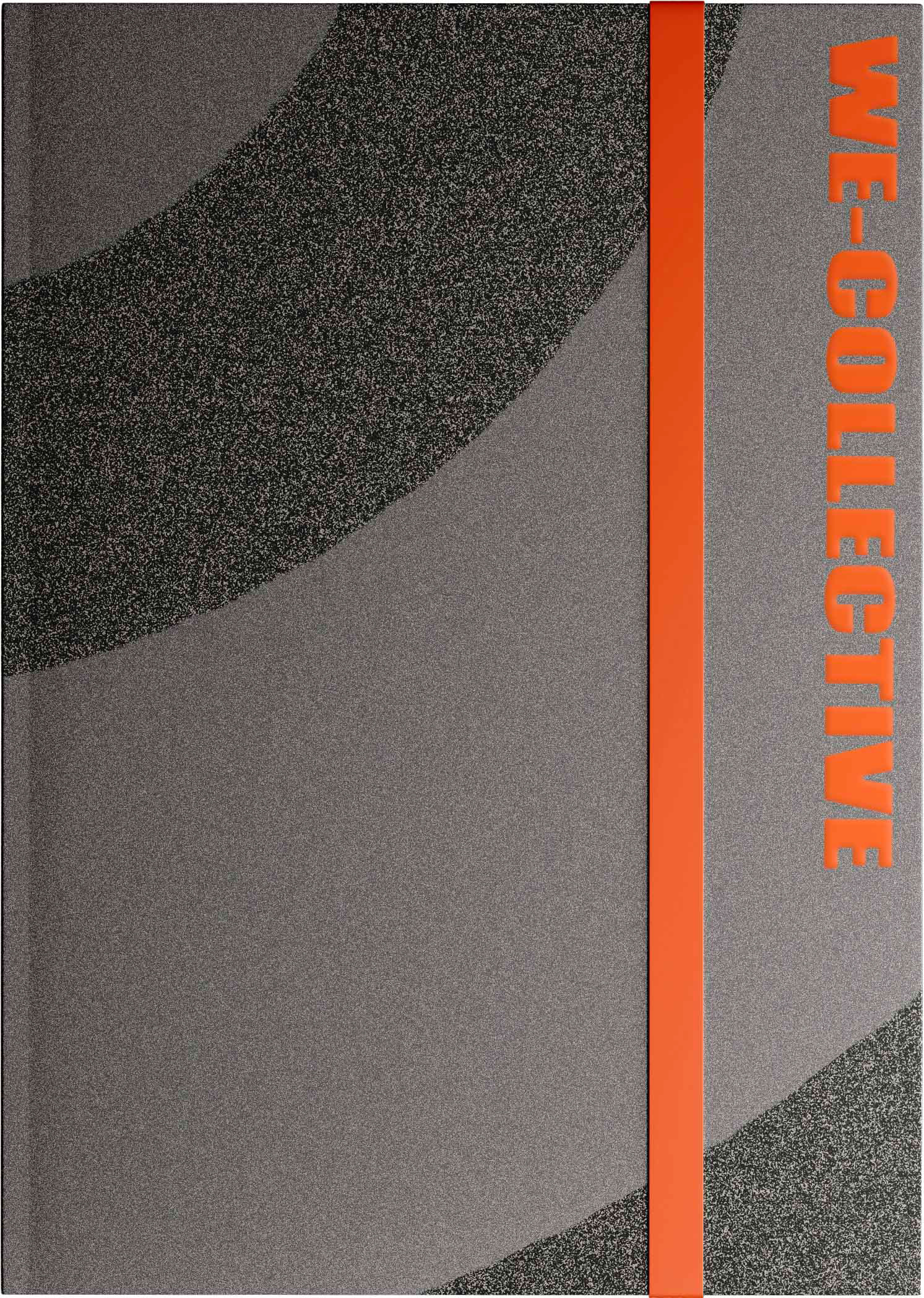

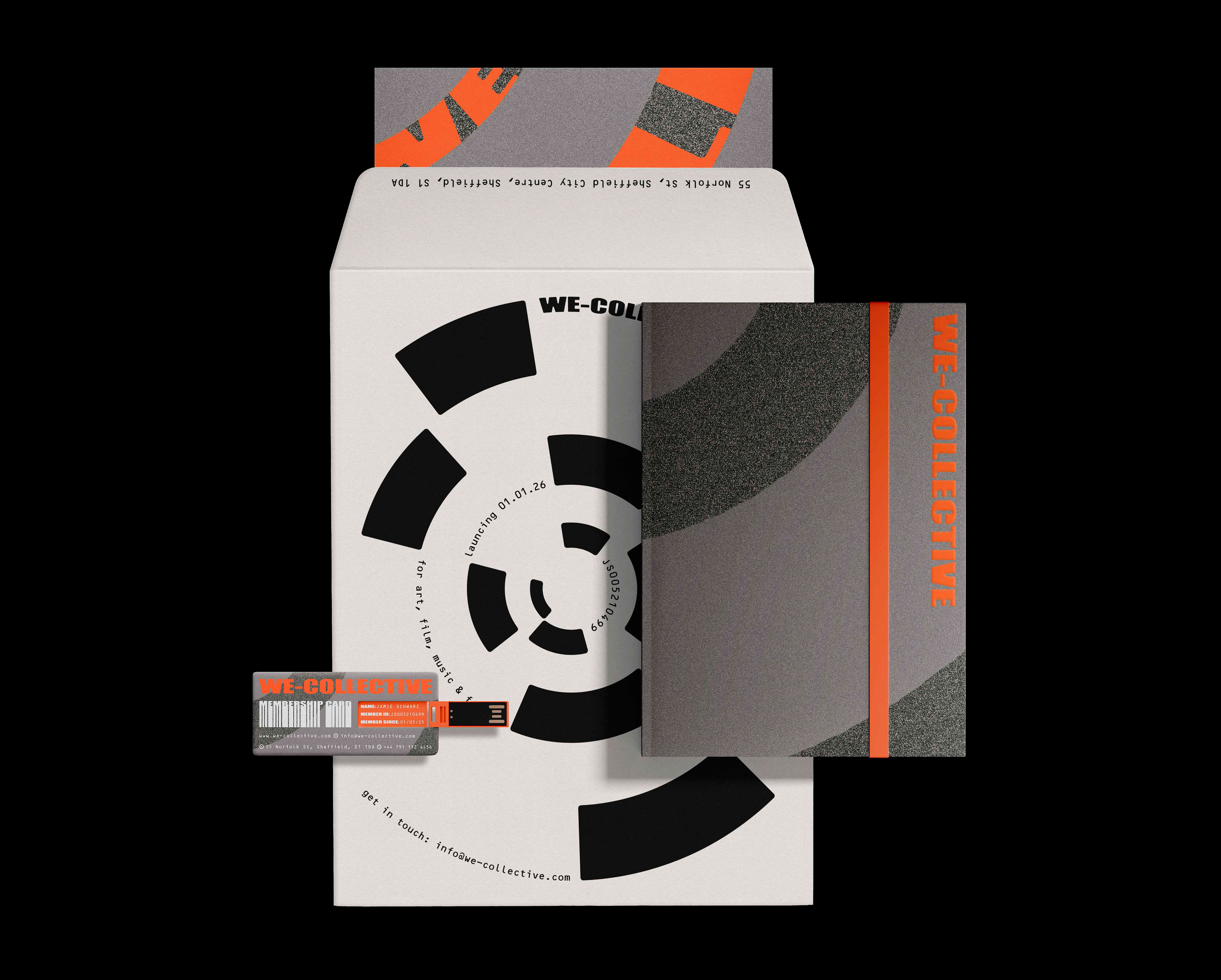
Physical media was developed to strengthen the connection between users and the blog while also driving subscriptions. Membership packs distributed to café customers included a card featuring a unique ID number and an encrypted password stored on the integrated flash drive. This password offers access to the 'members' section of the blog, which features exclusive content and resources.
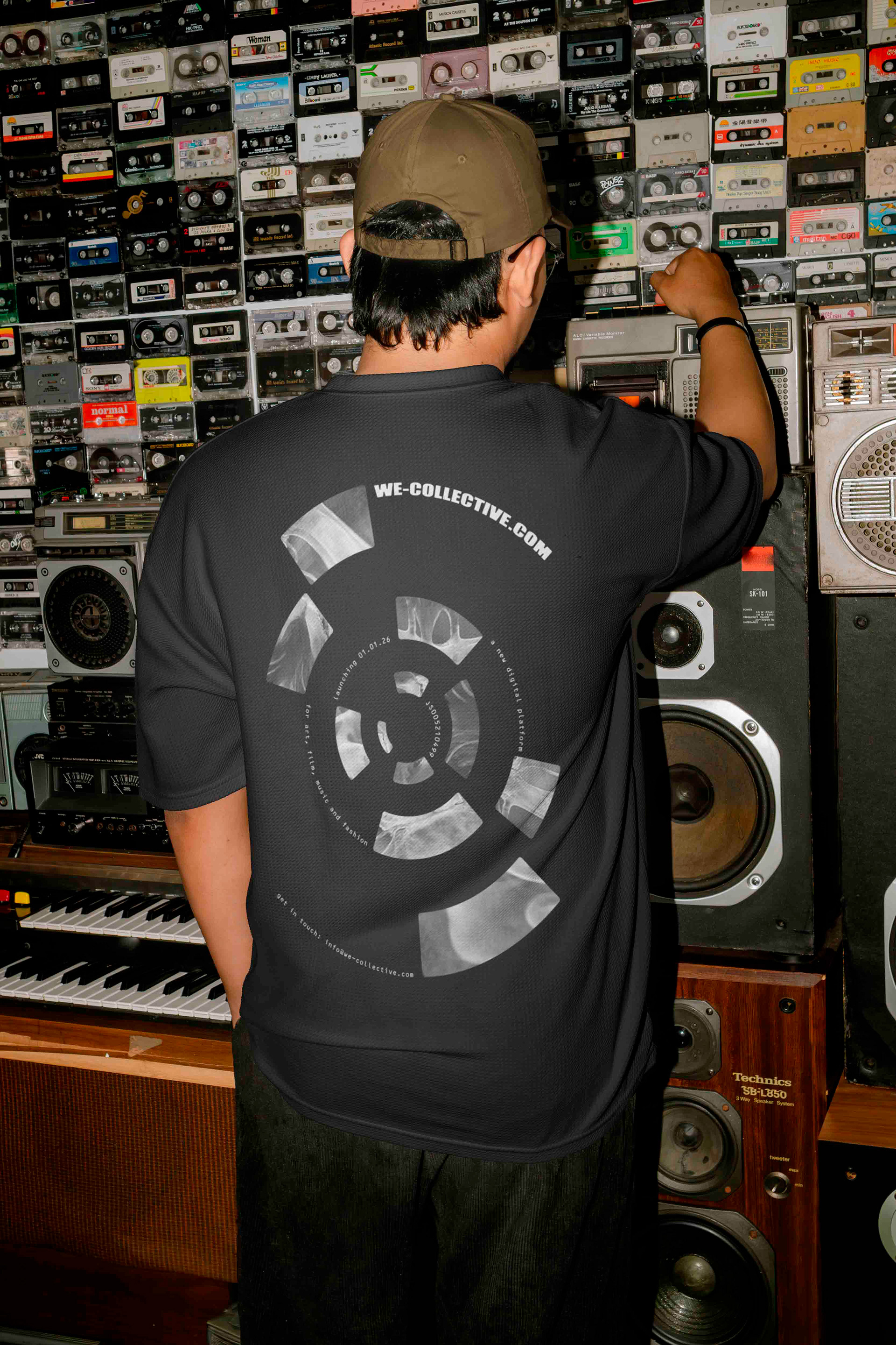
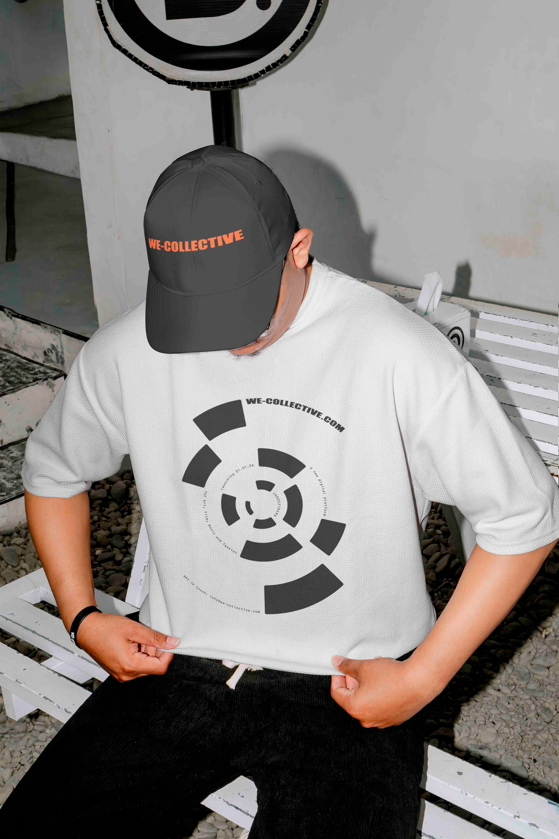
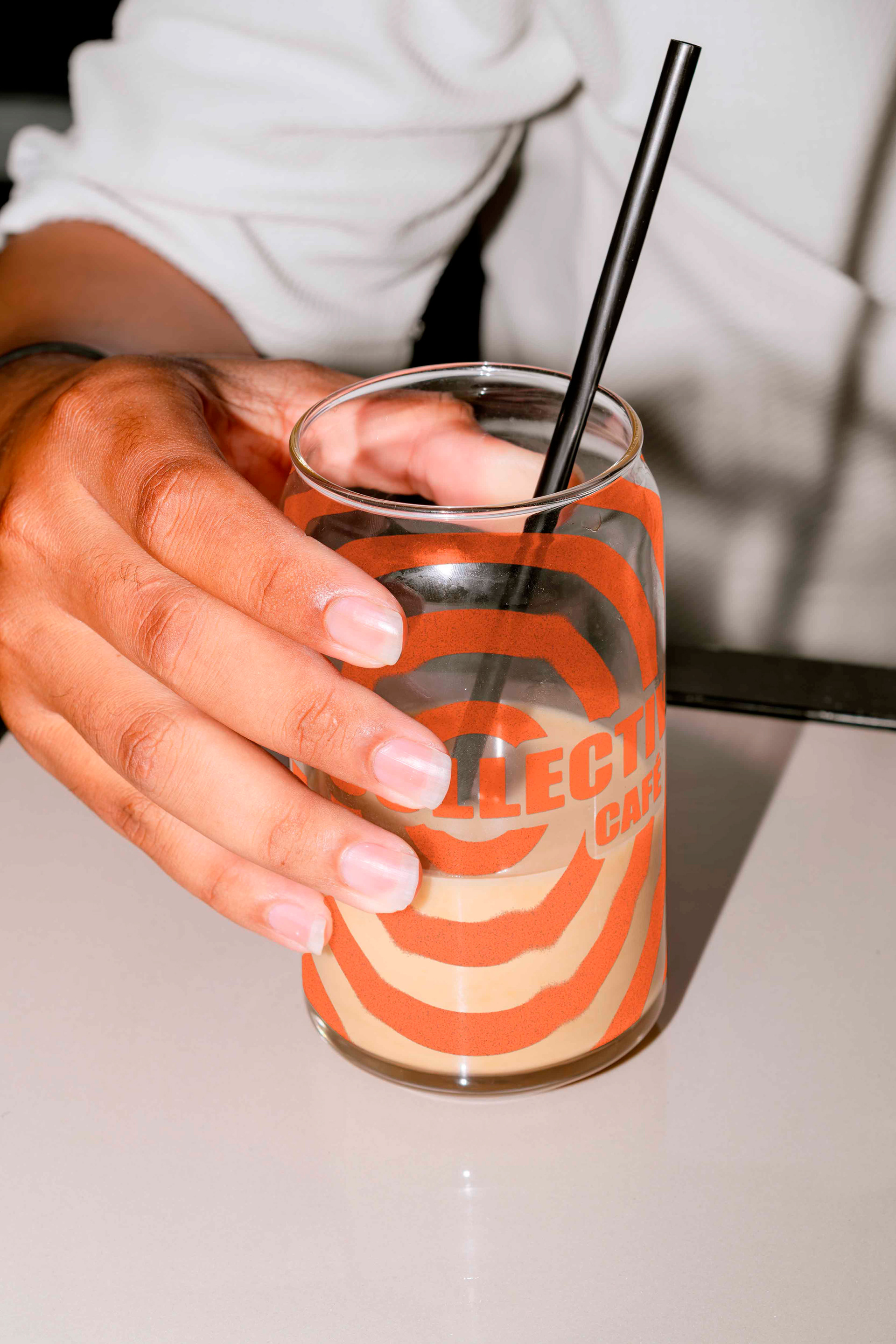
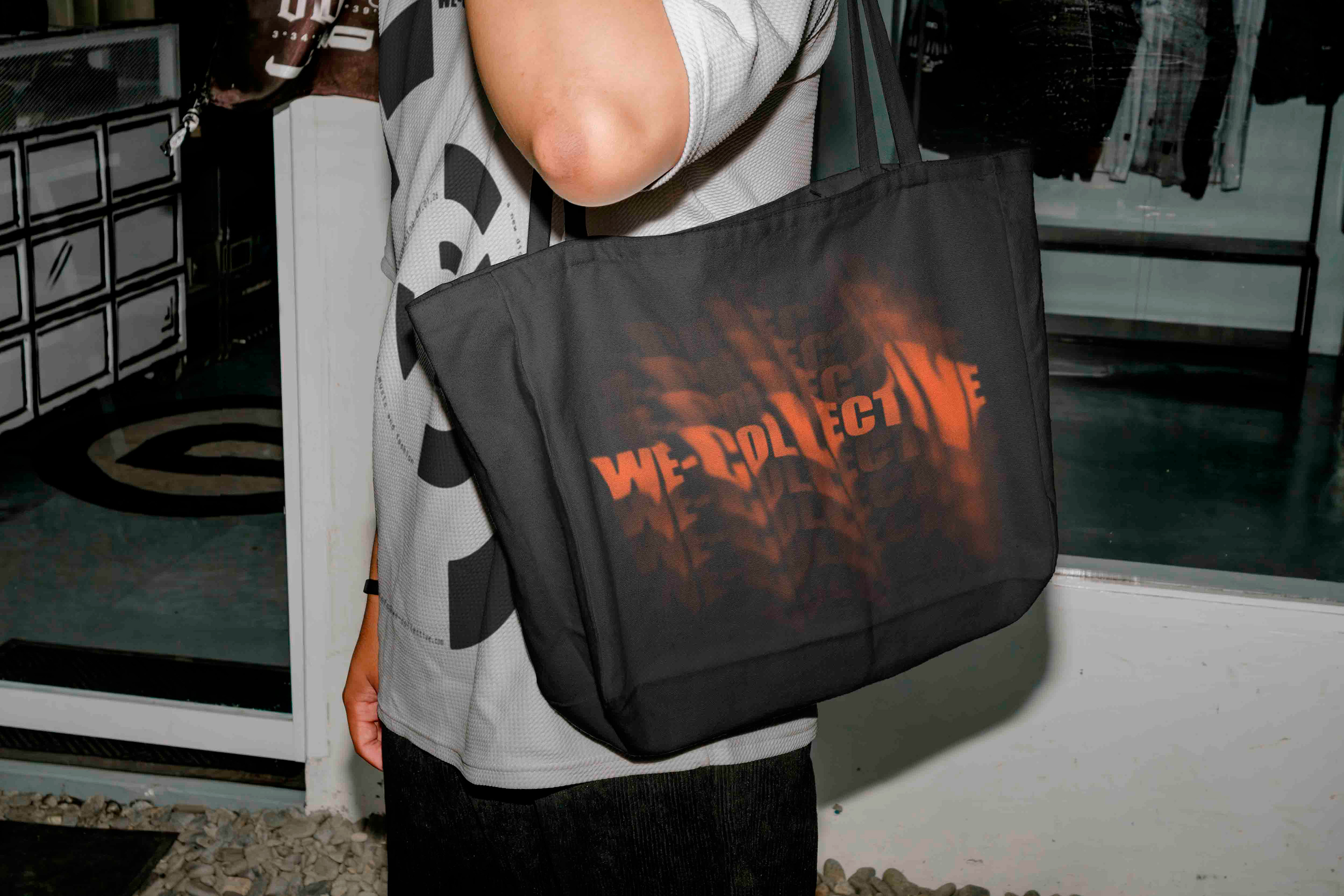
A selection of merchandise sold at the café and featured on the 'shop' section of the website.
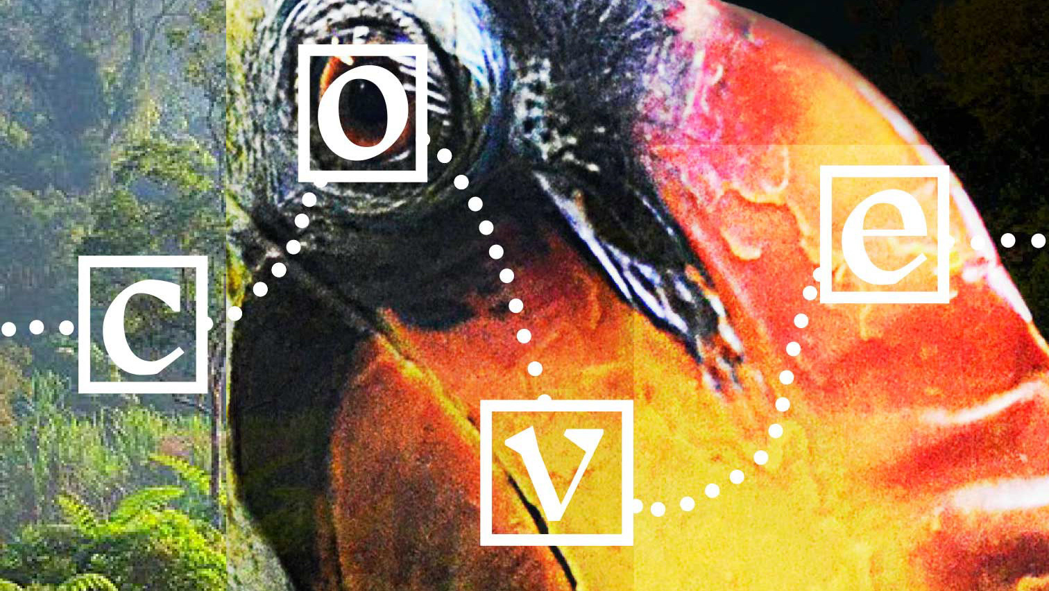
Out-of-home advertising incorporating the sonar-inspired motif. The heavy noise used for the background represents the digital ‘noise’ the blog sifts through to uncover the most original and inspiring work.
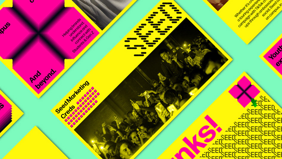
Promotional reels focus on reinforcing the community aspect of the blog with bold messaging overlayed on archive footage of crowds at raves and football matches. Carousel posts provide further insight into featured artists with their work taking prominence. Template elements are formed from crops of the billboard advertisement, providing visual continuity across touchpoints.
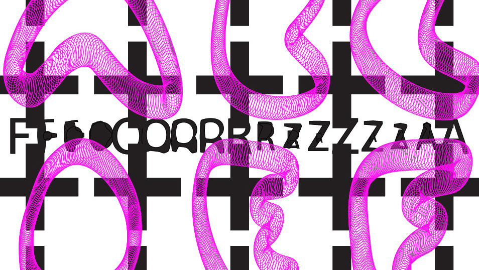
Motion graphics elements designed for digital out-of-home advertisements and video content applications.
